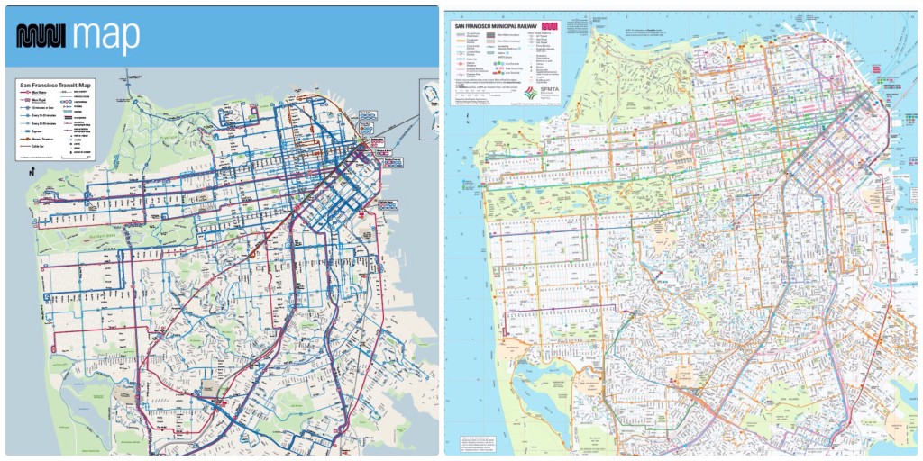
The San Francisco Municipal Transit Authority launched a Muni service increase over the weekend. Called Muni Forward, the changes included a new map that offers a cleaner, more readable perspective of the bus, light-rail, streetcar and cable car routes, but I’m wasn’t happy. Most of the following post is adapted from a comment I left on the SFMTA site.
I suppose it’s nice that it’s a cleaner presentation, but there are so many things missing from this new map compared to the last version. As someone who is only a frequent visitor, I appreciated being able to orient myself with the Muni map by comparing routes with landmarks that I’m either near or where I would like to go. Most of that is gone with the new map.
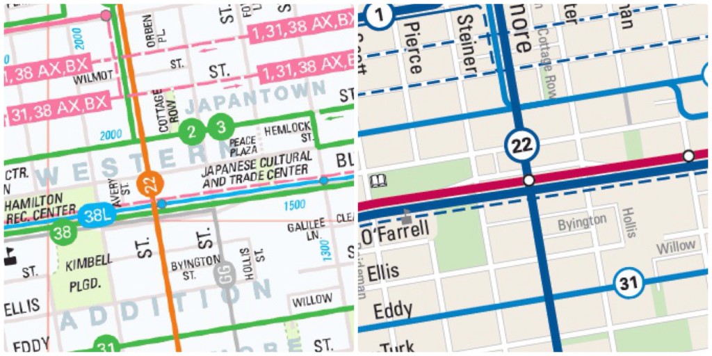
To give a recent example, I wanted to visit the first weekend of the Cherry Blossom Festival in Japantown. I knew the general location and the route, but I was much more comfortable telling my traveling companion where we were going when I could point it out on the transit map at the nearest shelter.
I couldn’t do that with the new map. There’s no neighborhood labels, even for the more commonly known ones (including Chinatown). If I wanted to know where Haight-Ashbury, North Beach, Castro and Mission were located, I couldn’t easily know for sure with the new map. While major streets are identified, the names of many smaller streets are omitted.
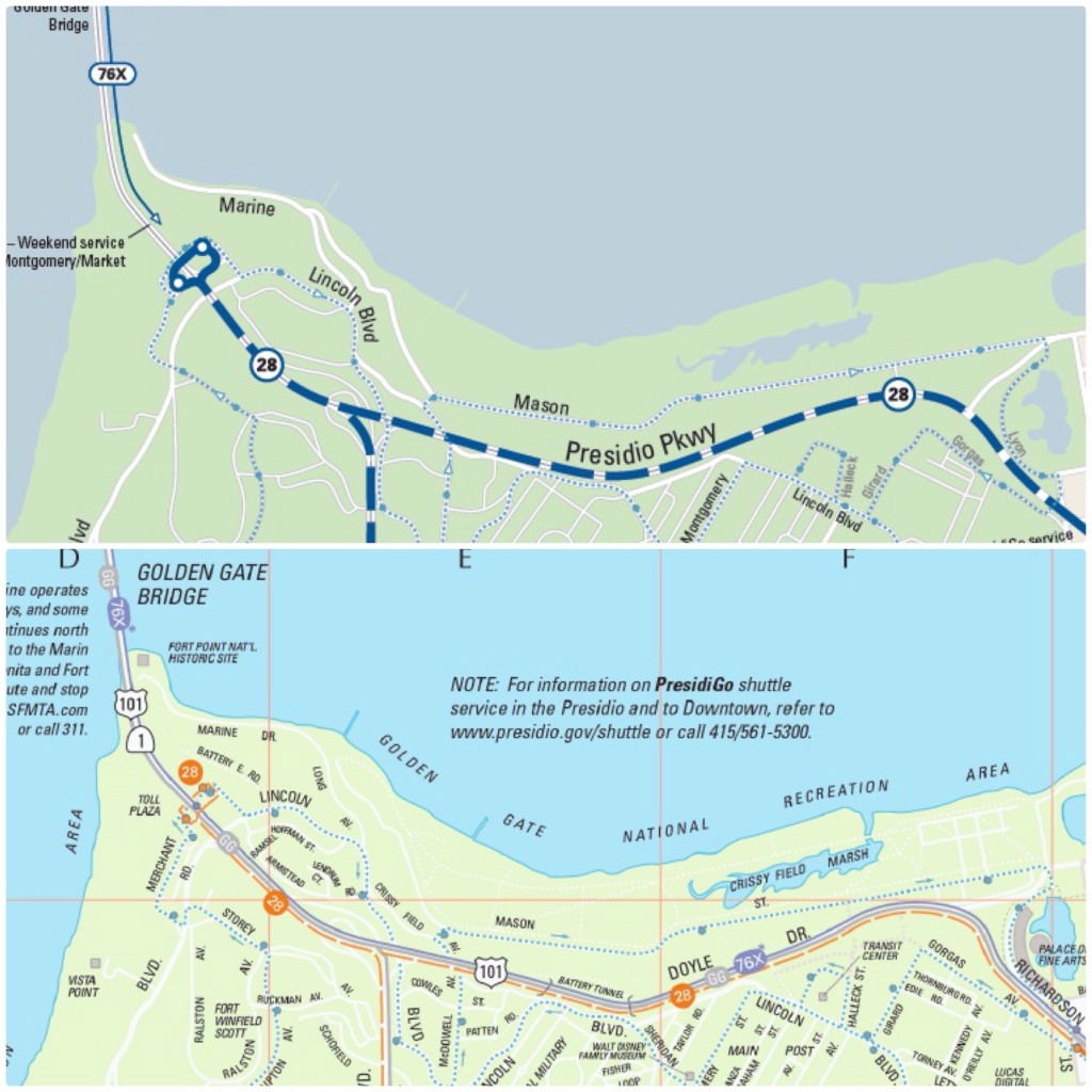
If I wanted to go to a specific place in the Presidio, like Fort Point, Crissy Field or the Walt Disney Family Museum, I could easily find those locations before whereas this new map of the Presidio is a relatively blank, green canvas. The new map is even missing the Palace of Fine Arts, which is one of the most-common sights in the city.
The map does have some advantages. Even looking at my examples, the map is easier to read and discern information about transit routes. It’s easier to follow some routes and determine when some limited-stop Rapid routes don’t stop for boardings and alightings.
Perhaps the map doesn’t need to provide as much information as it used to. After all, we’re in a world of smartphones, where most knowledge is available near instantaneously. Even before that, there were tourist guides and maps in multiple languages to guide people through this city.
However, cellphone batteries die and people don’t always have tourist guides on hand. Tourist guides and maps also tend to focus on the most popular or common, whereas the old map featured playgrounds, museums, community centers, even pier numbers.
I don’t know what the priorities were for this new map, but it doesn’t seem as user-friendly as it could be for tourists, visitors to the city or residents traveling to new neighborhoods. It’s missing many of the landmarks and detail that give much of San Francisco its vibrant identity. The map is ultimately a disservice to many transit users and will force them to turn elsewhere for less-optimal solutions.


