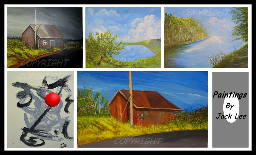
Sorry about the lousy photography. This knocks the quality of what you see by at least 50%, but you can still get an idea. The colors are much more vibrant in person. All comments are welcome.
I really liked the old shed theme, so I did it in twice, but different enough to make each unique. The Japanese painting was finished today and is one of my favorites. The Japanese you see in the lower right is only partially visible, but if you could see the whole thing it reads simply, “Destiny” and it has thumbprint in red that overlaps the left hand side of the word. The red ball is very 3-D, again, sorry you can’t tell that from the photo.
I learn by what you see, so feel free to comment. Please click on thumbs to see them a little better.
-Jack

