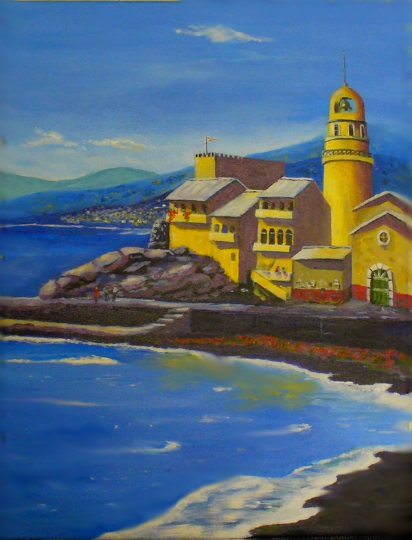
Unfortunately, the camera and the glare from lights takes away from the colors. Color is 100% better in person, especially the blacks on the sea wall. Notice the new bell tower? This made the tower taller and I took some of the lean out. Also notice the people on the sea wall? (This is a large painting, 24-X-36.)
I tried to employ as many of your corrections as I could and I am a lot more satisfied with the one now. What do you think? Feel free to be critical! -jack


Jack I love it…noticed the higher tower, the village and the people right off the bat…the little flag didn’t just materialize, someone placed it there! The color makes it bright, warm and inviting. (Not sure I like the yellow reflected in the sea…would it do that on a bright day?)
Whose buying the tickets?
Thanks Tina! The buildings are more subdued in the actual painting (lighter) and the blacks much richer. Lighting was poor when the picture was taken. You’re not getting the full spectrum with flourescent lighting.
I’m just about to seal the painting with a clear coat so if anyone has any suggestions/criticisms/comments better make them before this afternoon so I can chance the painting.